The same promise loops endlessly across LinkedIn and Instagram: "Comment CAROUSEL and I'll send you the prompt." Then comes a video of slides that look professionally designed, a master prompt for Claude or ChatGPT, and the pledge of viral carousels in five minutes. Then you run it yourself. The copy is usually fine. The design is not: washed-out colors, wobbly typography. Slides that look like everyone else's.
This is not a coincidence and not a user error. It happens because design cannot be reliably described in a text prompt. That gap matters, because anyone reaching for a LinkedIn carousel generator is betting on the right format: document posts, the swipeable PDF carousels, earn the highest engagement rate of any LinkedIn format at 7.00 percent, well above the 5.20 percent platform average (Socialinsider, 2026).
TL;DR: AI promises viral carousels from a prompt and ships generic slides, because typography and layout cannot be dictated in words, only shown through a reference image. The carousel format itself is one of the strongest levers on LinkedIn (7.00 percent engagement versus a 5.20 percent average). The way out of the prompt lottery is a generator that fully adopts a reference design and lets you adjust each slide's text and layout.
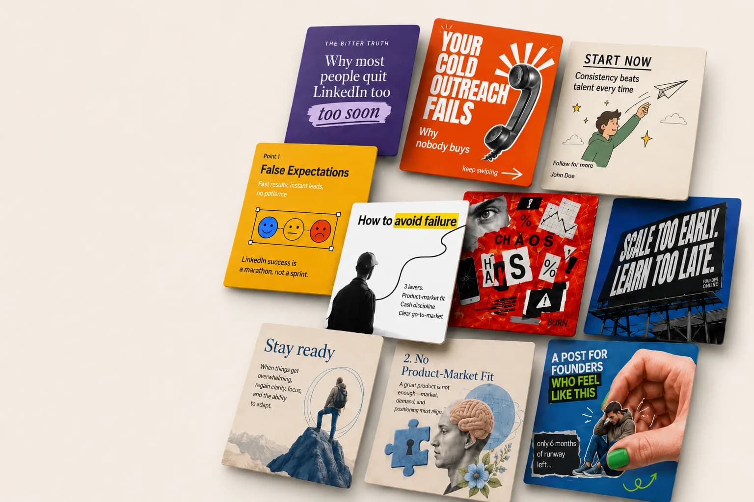
Here is what that looks like. Each image below is a complete 3x3 carousel, generated from the same text, only with a different design template. Swipe to see the range:
Why do AI carousels from a prompt look generic?
The flaw sits in the assumption that you can dictate a design to a language model the way you brief a designer. In truth, no sentence carries the information that makes a carousel good. "Elegant serif typeface, warm retro palette, hand-drawn accents" sounds precise, but it leaves the model a thousand degrees of freedom. It fills them with the generic average of its training data. That is exactly why the results look standard.
This limit shows up immediately in practice. A design described in careful prose, say cream note cards with blue ballpoint handwriting over analog film photography, keeps tipping into the wrong thing when rendered: the handwriting becomes a printed font, subtle accents turn into unrequested arrows, and the intended look lands as a "designed" default. The reason is always the same: words like "handwriting" push the model toward a handwriting typeface, not toward real ballpoint ink. Typography, card edges, film grain, and color rhythm cannot be described, only shown.
You never see this in the influencer video, because it shows a single, curated result. The trick was the chosen example, not the reproducible process. Run the same prompt at home and you get the variance the video edited out.
One objection deserves a straight answer: pretty design alone never saved a carousel. The idea and the hook on the first slide decide whether anyone swipes at all, and design only amplifies what is already there. But that is not an argument against good design, it is an argument against the prompt lottery, which delivers neither one reliably.
What does a carousel actually earn on LinkedIn?
The carousel is not a decorative format, it is the one with the strongest engagement. For its 2026 benchmark, Socialinsider analyzed about 1.3 million posts from 16,645 company pages between January 2024 and December 2025. The result: document posts top the ranking, ahead of multi-image posts and video, a striking departure from every other platform where video dominates, as Social Media Today (2026) notes in its coverage of the study.
The reason for the lead is the behavior a carousel triggers. Swiping through several slides keeps people on the post longer, and that dwell time demonstrably feeds the ranking: LinkedIn's own engineering team has described using per-post dwell time as a signal in feed ranking (LinkedIn Engineering, 2020). The format forces a pause while text and links scroll past in the feed. That is the lever for reach without an ad budget. For how that visibility compounds across a team, see our guide to the Social Selling Index.
One technical point many people miss: LinkedIn retired the standalone carousel post for organic content, and it survives only as an ad format (Oktopost, 2026). Today you build your LinkedIn slides by uploading a multi-page PDF as a document, which appears in the feed as a swipeable carousel. That sounds like a footnote, but it has a consequence: because each slide is its own PDF page, the design of every single page decides the effect. A weak layout shows up on every page.
Reference image over prompt: how a LinkedIn carousel generator adopts design
If design can only be shown, then the fix is to show it rather than describe it. A LinkedIn carousel generator that delivers polished results does not run on a blank text prompt, but on a design reference as its foundation. The reference image carries the style, meaning palette, typographic feel, finish, and imagery, and the model copies that style instead of reconstructing it from words.
Above that sits an art-direction layer that mediates between text and image. It decides, per slide, which background from the color rhythm applies, which word gets emphasis, and which motif fits the content, all without changing the text. Only this interplay of reference plus art direction produces six to nine slides that belong together rather than resembling each other by accident. That is the difference between a carousel that looks like it came from one hand and six slides that happened to hit the same template.
The gallery above shows exactly that: eight templates, from the heavy uppercase type of Orange Bold to the calm serif design of Lavender Editorial to the film photography with handwriting in Noir Notes. Each is a complete carousel from the same text, and none looks like the stock template half the feed uses. That is exactly where a prompt approach fails: it cannot hold one of these aesthetics on command, while a reference-driven system can. The 36leads carousel generator is built on exactly this principle, and you can try it free right now.
What you have to be able to adjust on a generated carousel
A generator that only churns out finished sets is a black box. The difference between a usable tool and a gimmick is whether the result can be adjusted down to the detail. Three levels matter:
- Text per slide. Each slide's headline, support lines, and call to action must be editable without breaking the layout. The copy is protected from the design layer so wording and characters stay intact.
- Design per slide. A targeted change to a single slide, a different emphasis or a different motif, must not reroll the whole set. The rest stays put.
- Order and selection. Reorder slides, drop one, pull the hook forward: the arc is part of the effect, not an afterthought.
Above all sits the principle any serious automation should carry: nothing ships that has not been approved. The AI does the heavy lifting, the decision stays with the human. A carousel you cannot touch is, in the end, just a prettier stock template.
When is Canva enough, and when do you need a generator?
If you post a carousel every few weeks and enjoy the craft, a Canva template or a simple carousel maker serves you well. The design is free, control is total, and the time cost barely matters because it happens rarely.
| Canva template | AI generator with reference design | |
|---|---|---|
| Effort per carousel | 1 to 2 hours of manual work | provide the text, review the output |
| Design consistency | hinges on one person's discipline | reference design holds the set together |
| Scaling (posting weekly) | bottleneck | core use case |
| Fine-grained control | total | editable per slide (text, design, order) |
| Best for | occasional one-offs | carousels run as a system |
The bottleneck shows up with repetition. Once carousels need to ship regularly and on-brand, every output is manual labor, consistency hinges on one person's discipline, and production dries up exactly when other priorities take over. It is the same mechanism that kills good content intentions: not a shortage of ideas, but a shortage of repeatability.
A generator does not solve the design problem of the single piece, it solves the consistency problem of the series. It keeps the format on-brand without rebuilding each slide, and it takes the prompt lottery out of the process, because the design is not guessed anew each time. Anyone running carousels as a system rather than an occasional exercise needs that repeatability.
Conclusion
The AI promise of the perfect carousel from a prompt fails on a simple truth: design cannot be dictated, only shown. That is why the circulating master prompts ship generic slides while the format itself ranks among the strongest on LinkedIn. The way out is not a better prompt but a different approach: a reference design the AI adopts, plus the control to adjust every slide in text and layout.
If you change one thing today, stop explaining your design to AI in words. Give it a design to copy and keep the fine-tuning in your own hands.
The LinkedIn carousel generator in 36leads follows exactly this principle: professionally designed templates as a reference, editable per slide, and part of a system spanning content, visibility, and pipeline rather than a standalone novelty tool. If you want to ship content consistently on LinkedIn, the pricing overview shows where it fits in the bigger picture. Try the carousels for free, the design popup opens straight in the app.
Sources
- Socialinsider LinkedIn Benchmarks 2026
- Social Media Today: Report shows document posts on LinkedIn see more engagement 2026
- LinkedIn Engineering: Understanding dwell time to improve LinkedIn feed ranking 2020
- Oktopost: LinkedIn carousel PDF best practices 2026
Frequently asked questions
Yes, but not as a standalone post type for organic content. The native carousel survives only as an ad format. For a regular post you upload a multi-page PDF as a document, which shows up in the feed as a swipeable carousel. That document format earns the highest engagement rate of any LinkedIn format, 7.00 percent versus 5.20 percent platform-wide ([Socialinsider](https://www.socialinsider.io/social-media-benchmarks/linkedin), 2026).

Stanislav Soziev
Founder at 36leads
Stanislav Soziev is the founder of 36leads, a B2B LinkedIn automation platform used by founders, SDRs, and marketing teams across DACH. He has spent the last decade shipping growth and sales systems, blending technical execution with go-to-market strategy. He writes about LinkedIn outbound, AI-assisted pipeline generation, and the mechanics of turning attention into qualified meetings.
LinkedInYour next 10 qualified leads start here.
Build your LinkedIn outbound, content, and AI conversations inside one cockpit. Nothing goes out without your approval.